Two maps of the 2012 US presidential election
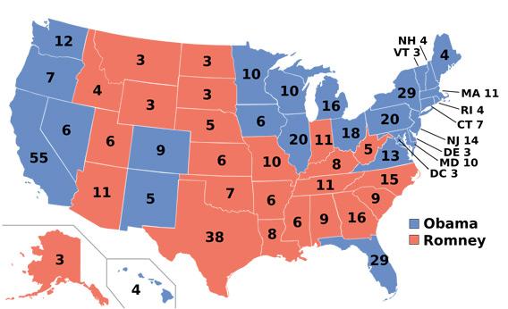
Last week Barack Obama was re-elected with a majority of 332-206 votes in the Electoral College (and a popular-vote majority of about 51%-48% ). Here's one representation of this outcome using a standard geographical format:

Using this familiar format has both advantages and disadvantages. You might note, for example, that a clump of 6 red states toward the upper left with a total of 21 electoral votes—Idaho, Montana, Wyoming, North Dakota, South Dakota, and Nebraska—occupies more than twice as much space as California, with 55 electoral votes. That can convey a misleading impression.
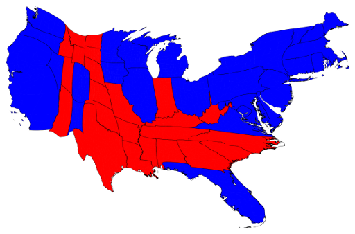
And here's a cartogram (by Mark Newman at the University of Michigan) with the relative sizes of states altered to reflect their relative weights in the Electoral College. As a geographical representation it will probably look startling or even weird to some of you, but in electoral terms it's actually a more realistic representation than the first map.

(For some further discussion about different ways of mapping the political geography of US presidential elections, and the ways that different modes of representing political reality can influence perceptions of that reality, see here.)
—Jeff Weintraub
UPDATE (11/20/2012) Stephen Colbert's post-election response: "Just because Obama won these blue states up here, he’s the president of all of them now? Look, Romney won all that red stuff. Why don’t we elect our president on square footage?"

Using this familiar format has both advantages and disadvantages. You might note, for example, that a clump of 6 red states toward the upper left with a total of 21 electoral votes—Idaho, Montana, Wyoming, North Dakota, South Dakota, and Nebraska—occupies more than twice as much space as California, with 55 electoral votes. That can convey a misleading impression.
And here's a cartogram (by Mark Newman at the University of Michigan) with the relative sizes of states altered to reflect their relative weights in the Electoral College. As a geographical representation it will probably look startling or even weird to some of you, but in electoral terms it's actually a more realistic representation than the first map.

(For some further discussion about different ways of mapping the political geography of US presidential elections, and the ways that different modes of representing political reality can influence perceptions of that reality, see here.)
—Jeff Weintraub
UPDATE (11/20/2012) Stephen Colbert's post-election response: "Just because Obama won these blue states up here, he’s the president of all of them now? Look, Romney won all that red stuff. Why don’t we elect our president on square footage?"


<< Home